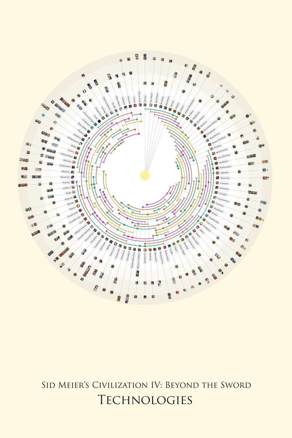
Civilization 4 Technology Wheel

Overview
A personal project to redesign a complex tree diagram with many overlapping lines and confusing symbols. Designed a circular graph to separate out relationships into arcs and spokes.
Role
- Visual design
- Development
Technologies Used
- Adobe Illustrator
- Java (Processing)
- JavaScript (D3.js)
This started off innocuously, as a Christmas present for my father. He's a long-time fan of Civilization 4, and I thought it would be nice for him to have a copy on his wall, made more legible and more clearly labeled than the the one that came in the box.

The original technology tree appears to be a linear path from left to right. However, the arrows have different meanings. One arrow is a mandatory path, two are different options. Some paths aren't even shown as lines, instead they are indicated by icons in the upper right of each box.
However, once I started trying to understand the workings of the technology tree, I realized this was actually one of the most complex tree structures I had ever encountered. It’s a non-linear tree with many overlapping paths, more like a maze than a tree. The original designer’s approach was to hide this, making the chart look much simpler than it actually was. My first attempt at a design was to reveal the hidden paths and organize them.

A first try at redesigning the tree, showing all of the paths that were hidden and identifying optional paths by colour. A major improvement in consistency, but much more of a maze.
The biggest issue I identified with this first draft was that the paths were often extremely long, which made it very likely that they would overlap. I tried shifting the positions of the technologies around, with little luck doing better. Some brief experiments with algorithms to optimize the nodes suggested there wasn’t much to gain. So instead, I tried wrapping the nodes around in a circle.

I’ve gone from a maze to a hairball. Not much progress, it seemed.
Finally, it hit on me to try merging the circle and tree concepts into one: this allowed for me to create a visually clear arrangement for the paths with a minimum amount of space. It also made for a good visual metaphor, showing the progress of technology in game as spokes in a wheel.
The current interactive version of the technology wheel.